
Studio AIO
Company
We are the font obsessed, pencil wielding, calligraphy loving, pixel addicts. We push the boundaries of design and challenge the norm. Where others see a blank canvas, we see the beauty of what could be. Tradition is our mentor, design is our creed. We are Studio AIO.
COUNTRY
Kuwait
CITY
Kuwait City
SERVICES
select a service to filter projects
PORTFOLIO
HUGE!
STUDIO AIO
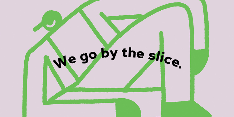
Huge! is an upcoming and exciting take on the traditional pizza. Based in Kuwait, Huge! offers "huge" sized pizza slices with bold flavors. Our logo approach was to focus on dynamic logo that captures the huge size of the pizza, where it changes its size with the addition of the letter "u" to our hearts content. The brand builds further on the logo's concept with an introduction of a unique character that is so huge that he barely fits any given space. This helped the concept really show through the implementation of size throughout. Everything came together in the packaging we have also custom made.
SAND GLOBE
STUDIO AIO
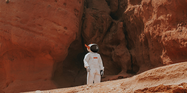
Sand Globe Productions is a creative animation studio based in Kuwait. Developing a project for an animation studio is boundless and it allows us to create something that allows us to explore further. Our concept takes the idea of an astronaut running on a globe. This provides the ground work for movement which is the core of their business. The astronaut is inspired by modern astronauts but with distinctive touches to the helmet and suit making him/her stand out. Foil, soil and classic computers were our main inspiration for the branding. We went a modern take on these elements allowing enough space for the brand to grow but more importantly allow their animations and productions to shine further. We had the opportunity to brand the entire project and we created, the logo, identity and stationery. Find out more about us on: www.studioaio.com www.instagram.com/studioaio
CLARIO
STUDIO AIO
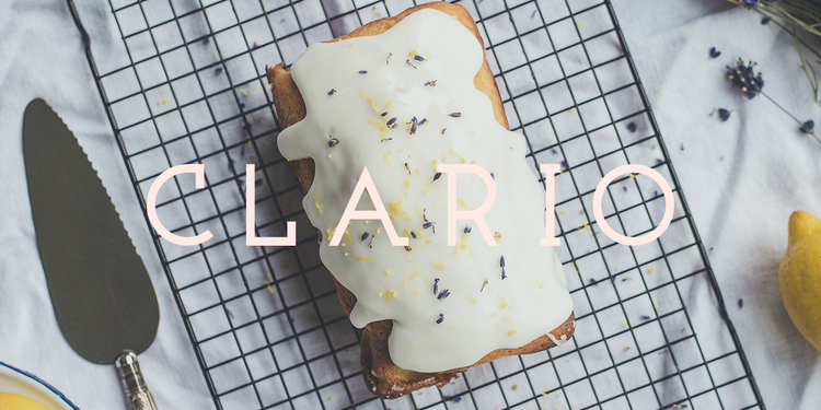
Clario is a Kuwait-based bake house that we had the opportunity to design entirely. We came up with the brand's name "Clario"; it's the old English word for "Clarion" which is a musical instrument. We created our concept around classy music, where the logo is the instrument and the brand is its audience. The brand features little illustrations and these are abstract representations of their offerings made in a way where they represent music notes. We made the style for these illustrations dynamic where they work in their smallest and largest forms. We had fun creating this abstract brand and continued on by creating custom packaging for cakes, pies and everything in between. Find out more about us on: www.studioaio.com www.instagram.com/studioaio
TAGOO
STUDIO AIO
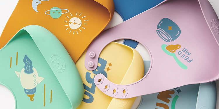
Tagoo is a kid-focused brand offering a wide variety of products including bibs. We wanted to create not only a logo but an identity and a story filled with adventures. Tagoo is a friendly astronaut tiger, he ventures the galaxies and invents products that improve children's lives. With that back story we made a logo with a happy tiger wrapped in an oval representing a helmet. The brand features cute illustrations all revolving around the idea of outer space. Our work continued for this project to include the full brand as well as product design where we designed colorful illustrations from Tagoo’s adventures to be used on bibs. Find out more about us on: www.studioaio.com www.instagram.com/studioaio
BOOST
STUDIO AIO
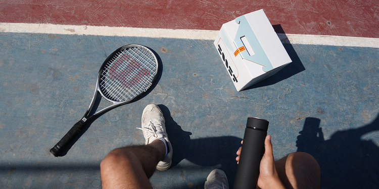
Boost is food subscription service based in Kuwait made for everyone. For the muscle builder, the health conscious or anyone interested in a consistent good quality meal. To meet this demographic we made a logo and brand that focuses on a lifestyle approach rather than something relating to weight loss. The logo features simplistic shapes creating an abstract logo that is read-able. The brand on the other hand is smooth and calm, heavy brands for subscriptions can get reparative over time so we opted for something that can live on for longer. These simplistic forms compliment the bold logo in all of the collateral. Our project also features the instagram template designs and packaging. Some of the beautiful photography was supplied by the client. Find out more about us on: www.studioaio.com www.instagram.com/studioaio
ALTERNATIVE INVESTMENT ADVISORY
STUDIO AIO
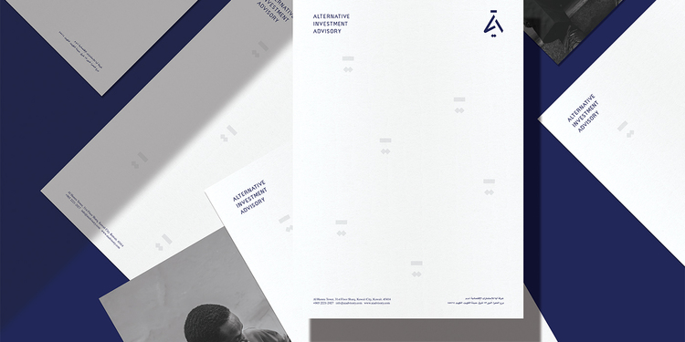
AIA is a financial advisory firm offering B2B & B2C services in the investment sector. AIA is based in Kuwait and though it is meant to be international, we found a way to incorporate the Arabic initials in the symbol for a localized touch. The Symbol combines three letters, A I A as well as "Aya" in Arabic. Going into this project we wanted to have a corporate identity but at the same time not feel intimidating, it is professional yet has enough to set it apart. Our work also involved creating the full brand identity as well as some other collateral. Find out more about us on: www.studioaio.com www.instagram.com/studioaio
REVIIVE
STUDIO AIO
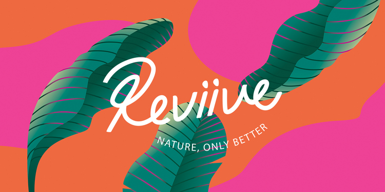
Reviive is a healthy bar based in the Kingdom of Bahrain. They offer healthy items such as smoothie bowls, sandwiches, coffee, etc. We jumped on board with the concept and came up with a full brand identity. Starting off with the logo, we wanted something unique, represents the business but also has some quirkiness. As a result, we came up with banana peel as a sub logo. The brand we designed compliments the colorful nature of the products. From pink swirls to leaf illustrations, everything came together for this awesome concept. Find out more about us on: www.studioaio.com www.instagram.com/studioaio
JAWLAH
STUDIO AIO
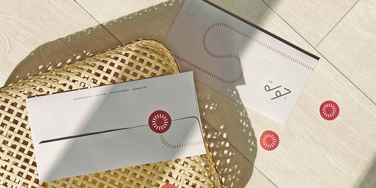
Jawlah is Kuwait-based online brand that focuses on shedding light on local businesses while sharing their opinions on products and services. "Jawlah" is the Arabic word for "Tour" and this brand tours around and finds the best Kuwait has to offer. Our focus for this project was to showcase Arabic typography in a modern light, the logo was custom made to have a sleek look which allows it to compliment the many businesses they work with. The brand builds on the concept of touring where we created flowing and intersecting paths that serve as an essential element in the collateral we developed for the brand. Find out more about us on: www.studioaio.com www.instagram.com/studioaio
FITTER
STUDIO AIO
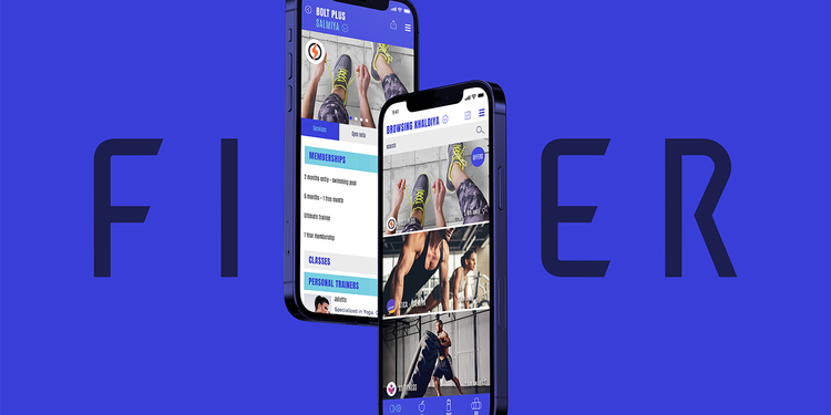
Fitter is a Kuwait-based app that is all about making fitness more accessible to the masses. Offering gym bookings, food subscriptions and products all under one inclusive app. When designing the logo we wanted to deliver the idea of an accomplishment and therefore we utilized the first letter as a flag, as flags are placed for each achievement. The app UI and UX was also fully designed by our studio where we managed to fit 3 major categories in a cohesive and easy to use app. Every section, every button and every scenario was carefully crafted to fully realize the fitter identity we created. Find out more about us on: www.studioaio.com www.instagram.com/studioaio
LEAP
STUDIO AIO
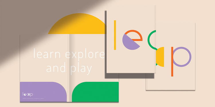
Leap, short for “Learn, Explore and Play” is a preschool based in Kuwait. This preschool is all about exploration, allowing kids have a good time while also learn through an intuitive curriculum. We wanted to create an identity that works for parents and their children alike where we have enough fun elements that work for both. The form of the logo and coloring promotes this fun aspect kids enjoy. The brand features a handful of fun illustrations that we purposed for most of the materials. From logo, packaging, stationery, instagram and so on, working with Leap has been quite a fun adventure. Find out more about us on: www.studioaio.com www.instagram.com/studioaio
THE COFFEE TRUCK
STUDIO AIO
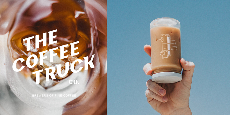
The Coffee Truck presented us with a unique medium to work with, a VW truck known for it’s adventurous vibe. TCT is a specialty coffee brand based in Kuwait which we had the pleasure of fully branding from the logo creation, brand assets, car decals and so on. The concept we created builds on the 1970’s theme but with a modern twist. The truck was illustrated in different abstract ways adding to the fun and quirky vibe. The logo typography was custom made to look classic yet modern in its execution. This project was a lot of fun to work on. Find out more about us on: www.studioaio.com www.instagram.com/studioaio
LOT THIRTY THREE
STUDIO AIO
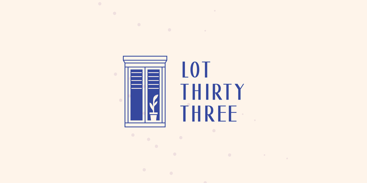
Lot Thirty Three is a furniture and accessories store based in Kuwait. We came up with the name “Lot Thirty Three” as we felt it captures the look and feel of lots and the 33 gives a bit of exclusivity and sparks intrigue. We approached the logo with a traditional loft window that promotes an inviting look. Depending on the color of the background, the logo’s interior of the loft seems to have lights on and other times lights are off implying the night and day cycle. We continued the project with branding that is inspired by tiles and our philosophy is that the logo creates the window, the brand has the base tiles and the products are what fills the space. Find out more about us on: www.studioaio.com www.instagram.com/studioaio
ROUTE
STUDIO AIO
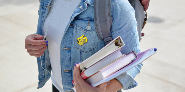
Route is an online learning platform based in Kuwait. When we were approached by the client we loved their passion in bringing education to the masses, specifically teens where they can enhance their academic skills through online courses. When we approached the project we wanted to create something that can be merchandised and have a cool aspect. This approach paved way for the project which builds the concept on pencil sharpeners and pencil shavings. The logo mark is simple enough but also recognizable. From there we built a brand that further enhances the idea and we took pictures of pencil shaving and made them part of the brand. Find out more about us on: www.studioaio.com www.instagram.com/studioaio
MASTERS
STUDIO AIO
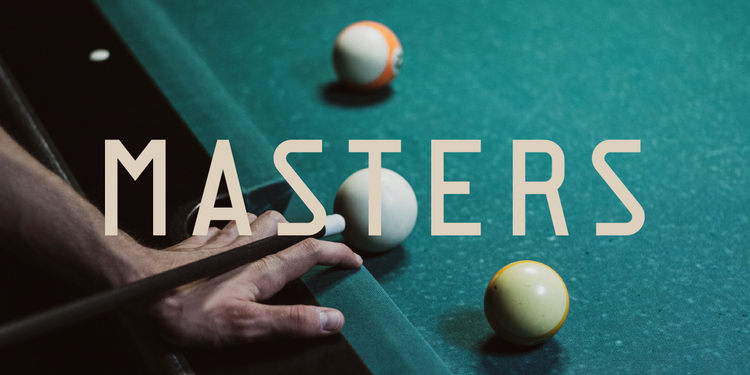
Based in Kuwait, Masters is a premium lounge offering billiards, snooker and VR experiences all under one roof. The lounge also hosts tournaments for hopeful competitors. We were in love with the concept and wanted to provide a brand that showcased the upscale theme while still being approachable. We set out on creating a logo that captures the competitive nature of Masters and designed a mark that resembles a medal with a lanyard that is shaped around the letter M. We also went with a color palette inspired by leather and velvet two materials that are prominent within the space as well as minimal lines reminiscent of lanyards. It was a lot of fun working on this project. Find out more about us on: www.studioaio.com www.instagram.com/studioaio
AGORA
STUDIO AIO
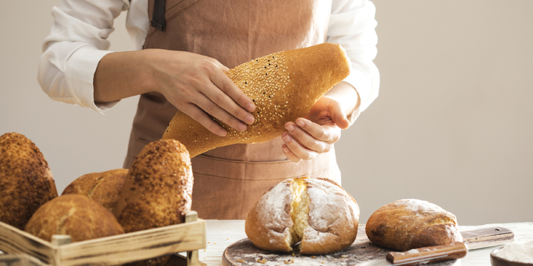
Agora is the Greek word for “Marketplace” and we’ve selected this name for this exciting project based in Kuwait. Agora is essentially a modern supermarket featuring gourmet products, hot food, pastries and more under one roof. Promising the highest quality and healthy options, we were tasked to create a full brand capturing that essence. Our logo wordmark was custom made bridging the old and new and we built a sub logo that abstractly represents supermarket racks. Building on that idea, the brand features simple shapes reminiscent of the many products under their umbrella all packaged in a calm color scheme. Our work featured a number of tasks including logo, packaging and more. Find out more about us on: www.studioaio.com www.instagram.com/studioaio
HUMMUS CHIPS
STUDIO AIO
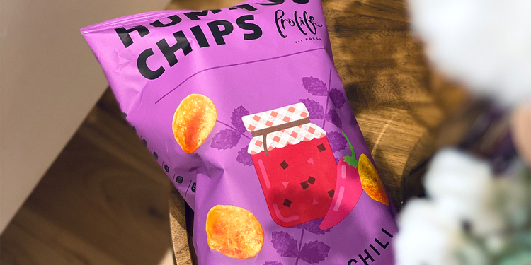
Hummus Chips is a subsidary brand of Prolife Foods which is based in Kuwait. We had the great pleasure of desiging this product packaging from the ground up giving it a vibrant color scheme. The designs also feature illustrations that go with the photographs of the chips that we took. The colors in particular are meant to stand out and we had this idea where, gluten free & organic food can be fun, hence our color selections. Find out more about us on: www.studioaio.com www.instagram.com/studioaio

ORP
STUDIO AIO
ORP - Off Road Performance is a Kuwait based brand offering high end solutions for off roading. Our focus in the creation of the logo is simplicity while being bold given the nature of the business. The logo slant showcases motion as a 4x4 traverses all kinds of terrain. The brand on the other hand embraces the idea of off roading where we created artworks that resemble dirt speckles splashing on all design material. Our work also included the design of the stationery complimenting materials. Find out more about us on: www.studioaio.com www.instagram.com/studioaio
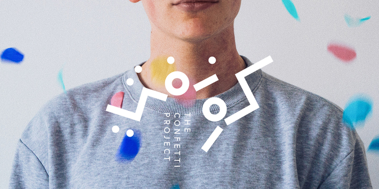
THE CONFETTI PROJECT
STUDIO AIO
Based in Kuwait, The Confetti Project offers a unique selection of sweets such as donuts, cookies and everything that puts a smile on our face. Finding inspiration in happiness, we were driven to create something very different. Starting with the logo which is based on abstract shapes of confetti shaping the word in Arabic spelling out “Confetti”. We strayed away from the traditional look and opted for a striking and modern design. The work expanded through fun packaging for their products with a focus on exciting shapes and a happy color palette. Find out more about us on: www.studioaio.com www.instagram.com/studioaio
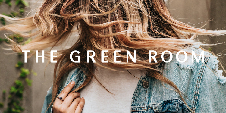
THE GREEN ROOM
STUDIO AIO
Located in the heart of Kuwait City, The Green Room is a ladies hair and beauty salon that we’ve had the opportunity to fully brand. With a unique name, we were inspired to do something a bit different, avoiding literal symbols and focusing on beauty and we found it in cotton plants. They are so intricate and beautiful and the logo mark was inspired by them. Following the unique concept, we go actual cottons buds, dabbed them in paint and used those marks as the main brand. Our work followed to the creation of packaging, stationery and print while embodying the image of beauty through messaging and a calm color palette. Find out more about us on: www.studioaio.com www.instagram.com/studioaio
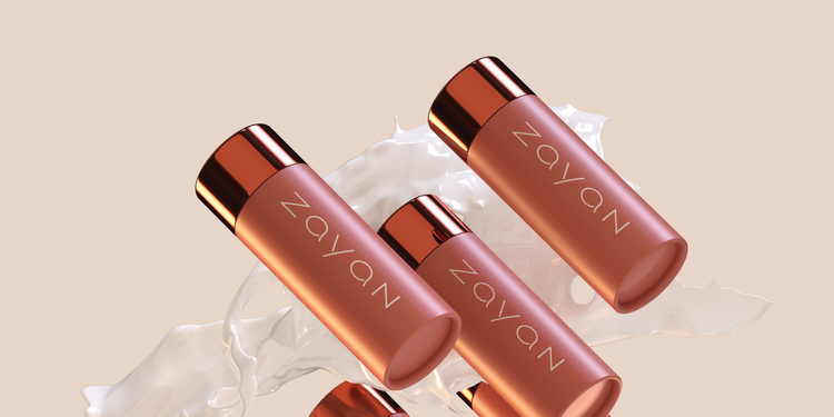
ZAYAN
STUDIO AIO
Zayan is a beauty brand based in Kuwait offering a wide variety of products from international vendors as well as their own creative solutions. The brand concept is all about embracing the inner beauty with calm colors, a logo inspired by the reflection of the moon on the sea. Furthermore, the brand features abstract flowing graphics that were inspired by the unique shapes created by the moon on the sea’s surface. The tasks for this project were massive, we created all the branding and mediums. Find out more about us on: www.studioaio.com www.instagram.com/studioaio
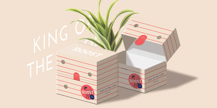
ROOST
STUDIO AIO
With many fried chicken places out there, we were set on creating a logo and identity that will be the “king of them all”. The logo created features a rooster in a commanding stance with vibrant colors. The typography of the text was inspired by features while the rest of the brand features patterns inspired by items around a chicken coop like hay, fences, etc. We have also custom built packaging that takes these concepts further with vibrant colors and patterns. It has been an interesting journey with this one we’re happy with how it turned out. Find out more about us on: www.studioaio.com www.instagram.com/studioaio
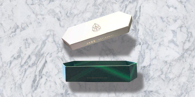
JADE ARTISANAL
STUDIO AIO
Jade is a Kuwait based chocolatier offering high end chocolates and cakes. We came up with the name jade as we were inspired by real jade crystals, their colors and their complexities, hence the logo abstract representation of its form. The branding features dark and bight greens inspired by jade giving a luxury look for the business. Our work also included the design of the packaging which was custom made to match the overall brand essence with sharp edges and hexagonal corners. Find out more about us on: www.studioaio.com www.instagram.com/studioaio
PRESS
STUDIO AIO
Press is specialty coffee bar based in Kuwait with a refreshing new take. Along with coffee, they offer soft serve and healthy foods. When we were introduced to the name, we felt we needed to do something different and avoid the typical "coffee beans" or "cups" as a logo and instead focus on a simple approach. The logo mark represents an abstract day and night cycle and that ties in with our message where it is always time for coffee. The branding on the other hand was simplified in favor of having a higher end look allowing Press to grow and add more categories to their business. Our work extended to include packaging as well. Find out more about us on: www.studioaio.com www.instagram.com/studioaio
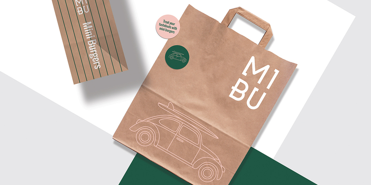
MIBU
STUDIO AIO
This time around, our project lives in the beautiful beaches of California. We were approached to create a branding for a sliders burger place so we came up with the name MIBU, short for “Mini Burgers”. Capturing the California vibes was one of our essential goals whilst reimagining it in a modern light. The logo features the classic beetle along with a surfboard, capturing a sense of adventure on land and on sea. The brand was kept minimal with a unique color palette and stripes complimenting the logo’s details. Our work expanded to packaging as well. Find out more about us on: www.studioaio.com www.instagram.com/studioaio
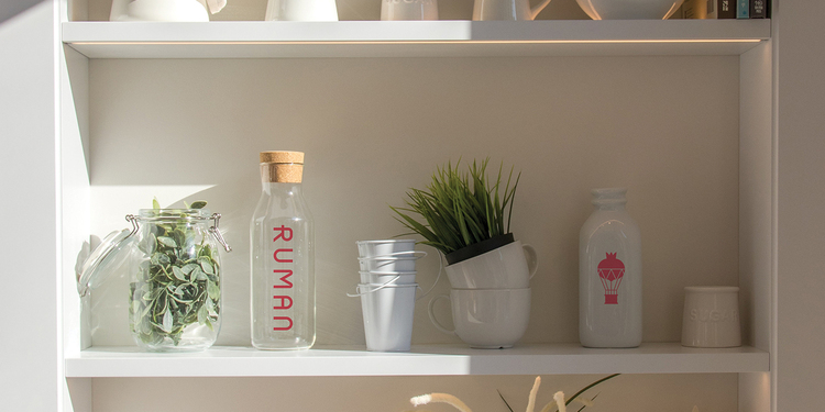
RUMAN CONCEPT STORE
STUDIO AIO
“Ruman” is the Arabic word for “Pomegranate” and with such a unique concept and name, we were inspired to do something special. Ruman is a store based in Kuwait, they travel the world and hand pick unique household and lifestyle products. With this idea in mind, we thought a hot air ballon is a great way in adventuring with style coupled with the balloon resembling a pomegranate. Our work proceed with the branding featuring pastel colors as well as creating the stationery set and packaging matching the brand aesthetic. Find out more about us on: www.studioaio.com www.instagram.com/studioaio
SOLID
STUDIO AIO
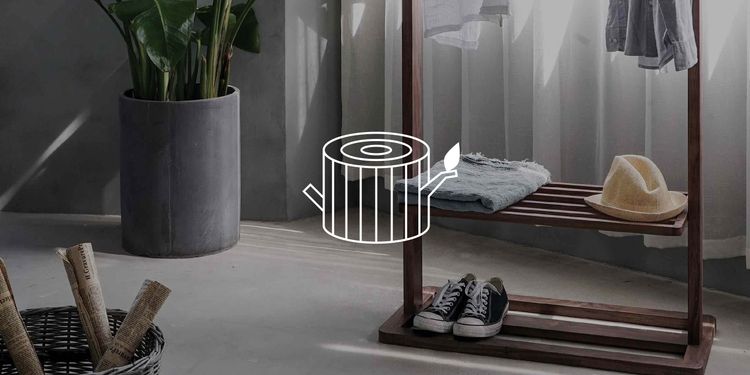
Solid is an exciting project we worked on for a wood-working shop based in Kuwait. They custom build closets, tables, doors, etc. Their approach to quality and fine design inspired us to create a very different logo. The logo we created is based on a tree bark where it showcases strength & durability. The branding continues the focus on wood with the creation abstract lines inspired by the tree rings. Find out more about us on: www.studioaio.com www.instagram.com/studioaio
GHAIN GHADA
STUDIO AIO
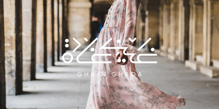
Ghain Ghada is a Kuwaiti fashion brand with an international following. The brand is known for their artistic designs and accessories since it was founded in 2012. We had the opportunity to create a brand new design direction starting with the logo that has an arabesques look but with a modern foundation. The brand was inspired by the flow of the fabric hence the creation of the brush effects. Find out more about us on: www.studioaio.com www.instagram.com/studioaio
WAHAJ
STUDIO AIO
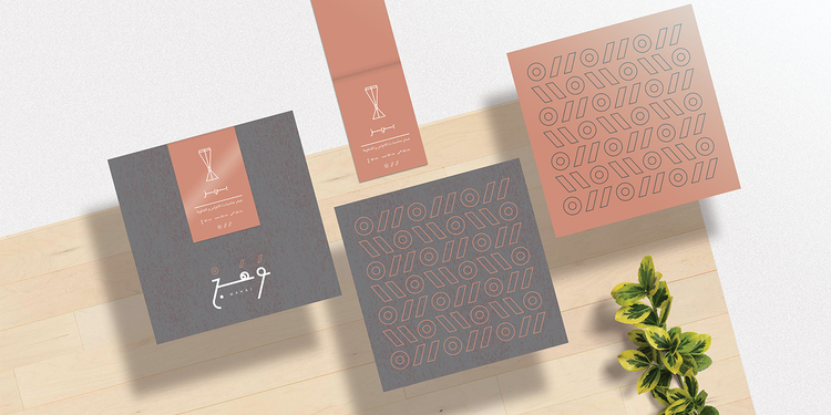
Wahaj is a local store that sells traditional home accessories that are reinvented for the modern age. The name Wahaj means fire or a glow in Arabic and is inspired by the traditional mubkhars sold in the store. We wanted to create a logo in Arabic with traditional elements but based on a modern style, much like the products offered. Find out more about us on: www.studioaio.com www.instagram.com/studioaio
AFTER WORK GAMES
STUDIO AIO
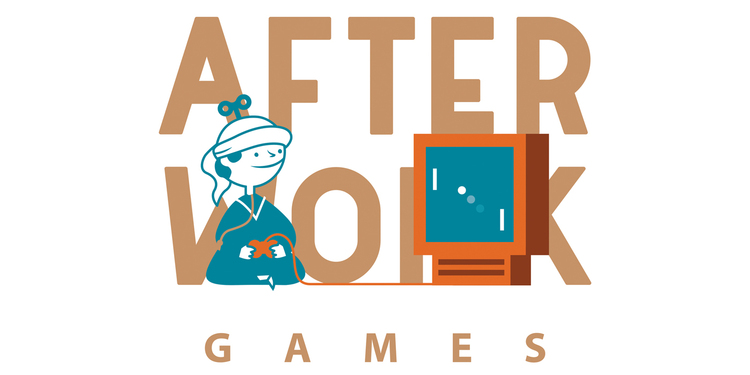
Meet After Work Games, a great game development studio in Abu Dhabi, UAE. This is one of those projects that has been an absolute pleasure to work on as the concept was brilliant and the people behind it are extra awesome! Find out more about us on: www.studioaio.com www.instagram.com/studioaio
SHIELD
STUDIO AIO
Shield is a premium engine oil company based in Kuwait. We were happy to take part in supporting and creating the brand identity for this locally made brand. The logo we designed portrays tough typography embodied with a shield with striking yellow. Our work also extended to creating their full lineup of lubricants of different categories. Find out more about us on: www.studioaio.com www.instagram.com/studioaio
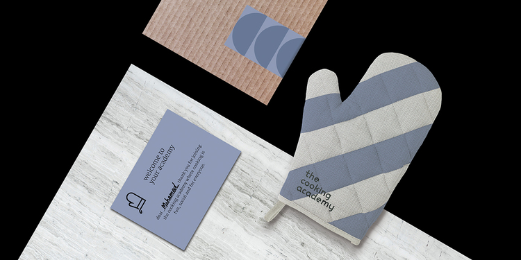
THE COOKING ACADEMY
STUDIO AIO
The Cooking Academy turns learning to cook into an art form and fun for everyone. We wanted to avoid the obvious logo marks used in the cooking sector and decided to do something unique. A "mitten" is a great representation of "hands on" involvement participants experience during their learning experience in the academy we felt represents the practice very well. We've also developed the rest of the project which includes a distinctive color palette across all the collateral work. A sub brand "kids" was made for kids classes which we created based on the logo but with a more of a hand-made look. Find out more about us on: www.studioaio.com www.instagram.com/studioaio
BAMBOO
STUDIO AIO
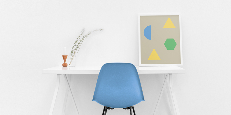
We were fascinated with the concept of Bamboo when we were approached by them, their concept was refreshing and something that is truly great to the region. Bamboo is a preschool, while most tend to more like daycares, Bamboo focuses on the notion of education through play. Everything from the curriculum and space encourages that. The logo we've created focuses on the playfulness aspect with bouncing letters while the brand identity sparks with color through shapes inspired by children's toys. Our work continued through the entire collateral from stationery, social media, forms, etc all sharing the principles of education through play. Find out more about us on: www.studioaio.com www.instagram.com/studioaio
THE FLOWER SOCIETY
STUDIO AIO
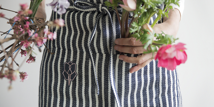
The flower society is a boutique flower shop founded out of passion and the idea of having a personal touch in every arrangement. We set out to create an identity that would highlight the personal aspect. We were inspired by the process behind creating the arrangement, hence the use of the florist's scissors in the logo that is also a flower. The color palette is based on soothing colors to complement the flowers and not overpower them. Find out more about us on: www.studioaio.com www.instagram.com/studioaio
HOPE
STUDIO AIO
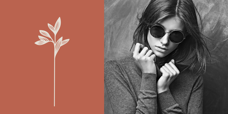
Hope is a Kuwaiti fashion brand that designs clothing and accessories. What inspired us to create this logo and identity is the message of "hope" that the client aims to create as an essential ingredient in clothing. As a result, our direction was to create a logo that is inspired by multiple plants as wherever a plant sprouts, hope exists. The brand builds on that idea and introduces a soft color palette. Find out more about us on: www.studioaio.com www.instagram.com/studioaio
THE GLADES
STUDIO AIO
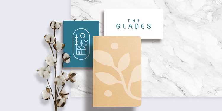
The Glades is a boutique store dedicated to offering a selection of products with the purpose of enhancing living spaces. From kitchenware to furniture, we designed the logo and brand to represent the concept of home and comfort. The design is complemented by soft colors with custom leaf illustrations that further enhances the concept. Find out more about us on: www.studioaio.com www.instagram.com/studioaio
HEAD SPACE
STUDIO AIO
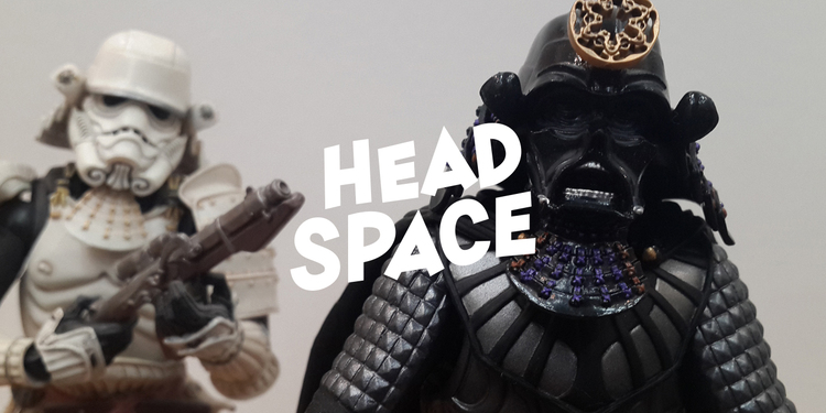
Head Space specializes in selling comics, figures and everything related to pop culture. The concept revolves around the location being both a physical and mental space where people can purchase these products as well as meet likeminded individuals. We created a logo that builds on this concept where the mascot's head is a speech bubble as everyone has a different space. The identity focuses on bright colors and typography that help bring out the logo. Find out more about us on: www.studioaio.com www.instagram.com/studioaio
THE BACKLOT
STUDIO AIO
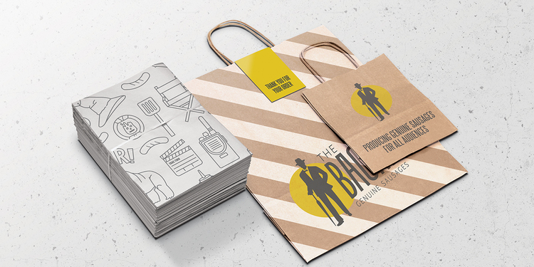
The backlot is a place that sells genuinely good sausages inspired by the food served on a movie set, hence the name "backlot". We wanted to to emphasize the inspiration by creating a logo, brand and packaging that would accentuate the movie culture that inspired the concept. Find out more about us on: www.studioaio.com www.instagram.com/studioaio
FINGER SUSHI
STUDIO AIO
Finger Sushi is a bold entry in the sushi restaurant business, combining the delicious delicacy of sushi and the ease of the fast food industry. We were intrigued by such a project and were asked to develop a full brand from logo, packages, car decal, menu and more. The logo is complemented by an entire set of colorful packages that are inspired by sushi ingredients along with other items that bring everything together. Find out more about us on: www.studioaio.com www.instagram.com/studioaio
THE KOKO TREE
STUDIO AIO
The Koko Tree is a newly established businesses specialized in handmade chocolates. From the beginning we started by naming the project as we wanted to visualize a concept that represented the natural source of chocolate, the cocoa plant. Through the logo and brand design, we kept a natural theme by creating illustrations of leaves and and earthy color palette. Creating the packaging was the most interesting and challenging aspect as the design had a unique structure that would further emphasize the product quality. Find out more about us on: www.studioaio.com www.instagram.com/studioaio
SUGAR COATED
STUDIO AIO
Sugar Coated is a project we truly fell in love with. We were given the opportunity to create the whole brand starting from the logo all the way to the booth design. Sugar Coated is a Kuwaiti business that creates delicious chocolate dipped strawberries, we wanted to capture the essence of the taste and nostalgic themes throughout the brand, packaging, photography, website and booth. www.sugarcoated.com Find out more about us on: www.studioaio.com www.instagram.com/studioaio
BATTLE OF THE EAST
STUDIO AIO
It was just three years ago when we fully developed the logo and brand of Circuit Plus "Battle of the East", a crossfit event held annually in Kuwait with competitors from all around the globe. This year we were tasked with creating a theme for the event, and wanted to portray a cultural aspect. Which resulted in the concept of creating illustrated characters portraying warriors inspired by the Arabic/Ottoman Era. These illustrations were used across a number of items that we created such as invites, tickets, badges and merchandise. Find out more about us on: www.studioaio.com www.instagram.com/studioaio
QOUT MARKET
STUDIO AIO
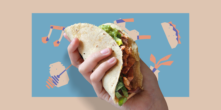
Qout Market is a Kuwait-based organization with the aim of empowering the local community through seasonal markets while showcasing local produce and home grown talent. We set off to design the new brand identity filled with bright colors and illustrations that would complement their motto of “brining joy”. The illustrations are made with a hand-drawn style to represent the personal connection that the market has with its vendors and those who attend. Our studio designed the branding as well as the illustrations and the logo had been previously designed by “The Yard”. Find out more about us on: www.studioaio.com www.instagram.com/studioaio
TINY CRISPY
STUDIO AIO
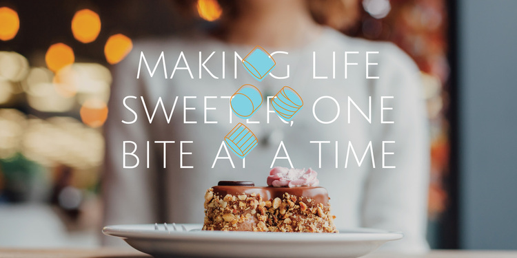
Tiny Crispy is a dessert shop specialized in creating rice crispies. Their unique take on the classic offers a wide range of flavors fit for gatherings. In our logo design which features a custom typography in Arabic, we wanted to empathize "tiny" and to compliment that we made a logo featuring a bird on a little rice crispy. The brand is also a big part of the project where we created a series of abstract shapes mimicking those of rice crispies.
MANARA
STUDIO AIO
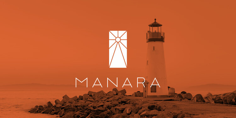
Manara is a mall complex in the heart of an industrial area in Kuwait. Manara is Arabic means “lighthouse” and it is a name we came up with that we felt captures the essence of the mall itself shining bright in the industrial city. The logo mark is an abstract lighthouse casting its light in all directions. The branding is based on simplistic geometric patterns inspired by Arabian patters. There is also an emphasis on plants as the mall features terrances. Finally, our work concluded with a brochure that captures imagery and briefs about the project. Find out more about us on: www.studioaio.com www.instagram.com/studioaio
AGNII
STUDIO AIO
Agnii is an exciting project we recently worked on for an Indian restaurant based in Kuwait. In India, Agnii translates to "fire" and our whole inspiration revolved around creating fire, using matches. Since the food offered is inspired by India with a complete re-imagination of Indian food, we wanted to draw inspiration by the rich culture and bring it in a new light. Our brand includes vibrant colors, match patterns, creative typography & illustrations. Find out more about us on: www.studioaio.com www.instagram.com/studioaio

BRAVO
STUDIO AIO
This was an exciting project for us, the client approached us with a unique name and a unique concept. Bravo! is a new take on Italian food, specifically pizzas, pastas and risottos with a modern twist through a delivery only business. We ran with this concept and created an identity that brings the famous food in a very modern way, in a bright palette with an emphasis on excitement portrayed through the word mark. Additionally, the symbolic logo features clapping hands, we thought to ourselves "tastes so good, it deserves an applause" and we went with it. The brand also features fun illustrations for the 3 categories of food. Our work continued on menu design, packaging, etc. Find out more about us on: www.studioaio.com www.instagram.com/studioaio
THE HORSE CO
STUDIO AIO
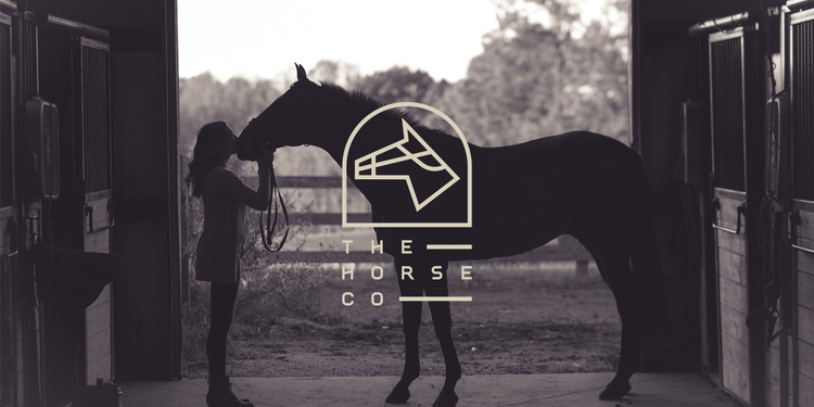
The Horse Co is Kuwaiti-based online marketplace that offers a base for all your equestrian needs from riding gear to supplements they've got you covered. Our focus was to create a brand that had an elegance much like horse riding itself, using a color palette that would further develop the concept. Our task included designing the logo, brand, stationery, car, website & app design. Find out more about us on: www.studioaio.com www.instagram.com/studioaio
AMP
STUDIO AIO
AMP is a speciality coffee shop located in the heart of Qatar. With a unique atmosphere and dedication to quality, our studio was set to create an identity that would bring life to the concept. We started off with naming the business "AMP" as coffee amplifies life, followed by the logo, packaging, etc. The identity features dark and light tones with sharp elements that compliment their products. Find out more about us on: www.studioaio.com www.instagram.com/studioaio
BONFIRE
STUDIO AIO
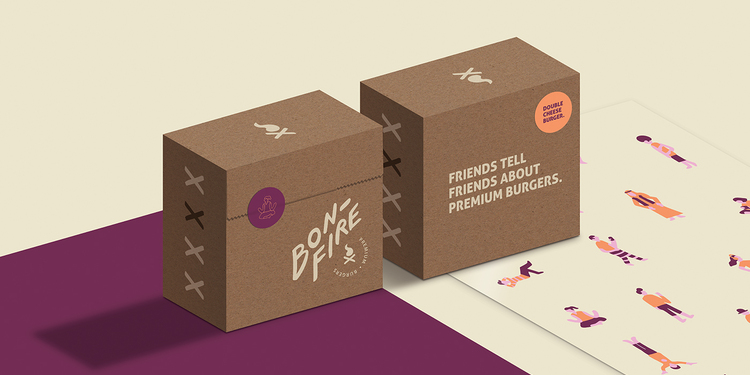
There are plenty of burger joints out there but we wanted to take this brand into a new direction. We started off by calling it "Bonfire" as its prime focus are the people that gather around it. We've built a logo and symbol that captures the bonfire look and feel with typography that is hand made. The brand features bold colors with illustrations that depict all walks of life that would ultimately gather around "Bonfire" for their exceptional burgers. Find out more about us on: www.studioaio.com www.instagram.com/studioaio